Living documents as a UX pattern in AI
We use LLMs to create a complex, editable document with everything science knows about a topic. Let's explore the use case motivation and the product design challenges of these living documents.

As large language models (LLMs) take the tech world by storm, every product is suddenly sprouting an embedded chat box. But a greater opportunity exists: to weave AI capabilities into more sophisticated UIs.
At Elicit, we’re building a tool for searching across scientific literature and semantically extracting data from those papers. The result is a huge table populated with the results of thousands of LLM data extractions.
Using AI to create a complex, living document with everything you know—or indeed, all of humanity knows, as documented in the scientific literature—is a grand and challenging undertaking.
In addition to the engineering aspects (described in an upcoming post), there are a host of user experience and product questions to grapple with. This article describes those challenges and Elicit’s approach to solving them so far.
In this article we’ll explore three areas:
- Decomposing interactions with the AI. Instead of a linear back-and-forth (as in chat) or one request-response cycle (as in search), thousands of individual language model actions are assembled into an editable table. UX questions here include handling results that take a wide variety of response times (from less than a second to many minutes), and handling the common case of outright failures of the language model backends.
- Managing heavy LLM workloads, without feeling like a batch workload manager. We want to present our users with a sleek, approachable interface that feels similar to search or a spreadsheet. The interface should be fast and responsive at all times, even though the UI is effectively a control panel for a massive parallelized set of compute operations.
- Visualizing cost and avoiding surprise. Running lots of language model calls gets expensive. We need to surface some indication of operation cost to users, especially given the batch workloads mentioned above. But LLM call costs are unknown up front and so can only be an estimate. No one likes surprises here.
The article will wrap on what open questions remain (many!) as we explore this frontier that combines a serious professional use case with LLMs and a complex, editable document in the user’s browser.
Use case: systematic review
As a basis for understanding this “living document” approach, let’s look at a key use case for Elicit: systematic review.
Consider, for example, a medical device company bringing a new product to market. They need to survey all existing literature on the disease that the device treats, and existing drugs and devices that treat that disease.
The conventional approach to this is a process that takes one person or a small team working for 3–6 months. The existing manual process involves collecting the papers as PDFs in a folder, reading each one (!), and then extracting data from each paper into a giant Excel spreadsheet. Two people working for six months may add up to 2,000 hours of human labor!
This is a critically important project in many domains, but it's a time-consuming and often mind-numbing process. This is where Elicit enters the story.
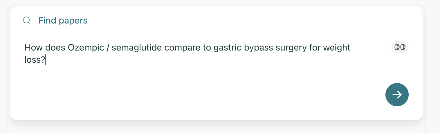
Using Elicit, the researcher doing systematic review start with a literature search—not unlike Google Scholar, but with AI-powered semantic search results.
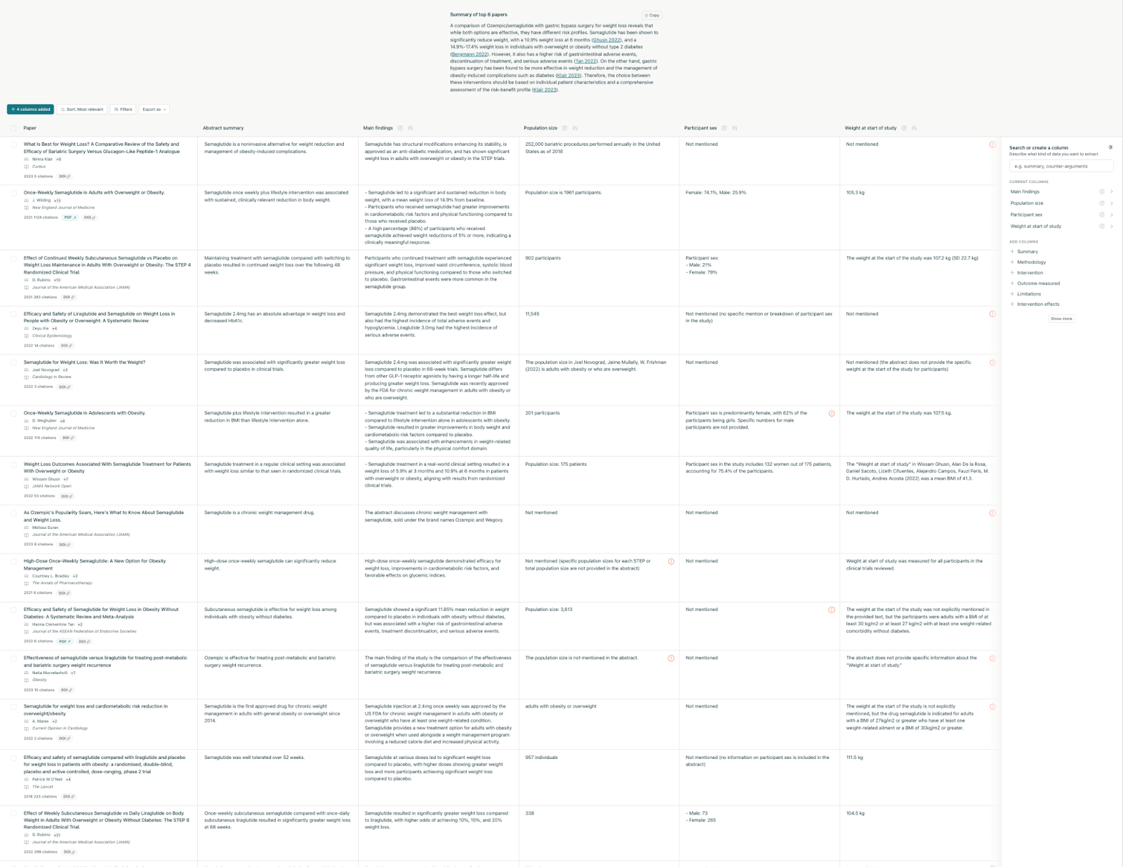
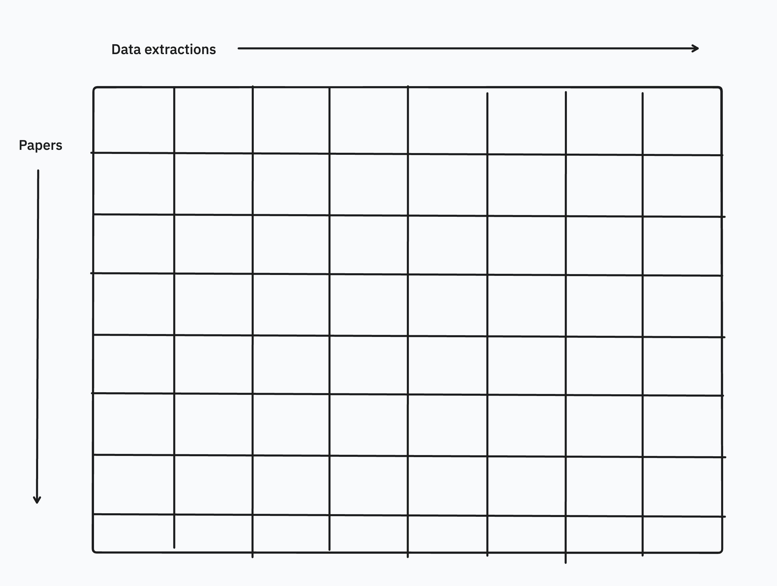
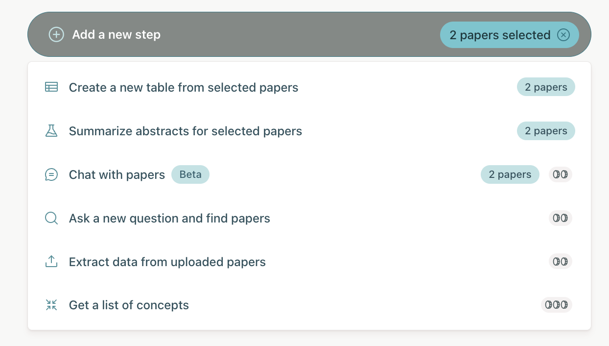
From there, they begin to populate an in-browser data grid (instead of an Excel sheet), with papers in the rows, and data extractions from those papers in the columns.
The results stream into a table of data, with papers listed vertically. The columns are results extracted by the LLMs from the papers, such as main findings or population size.
At first glance this might resemble results from a classic web search: a paginated list of mostly-static links. But in fact this is the first step of our living document.
The result set can grow, shrink, or change on both the X and Y axis as the user adds filters, new columns, and new papers. But more dramatically: this not a one-off search result, discarded as soon as the user closes their browser tab. Instead it is a document edited over the course of weeks or months.
It's important to note is that this is not an “AI replaces human” scenario. A knowledgeable human operator works together with the computer in a process of refining the search query, scanning/filtering the papers, experimenting with different column names (themselves a type of query that drives the data extraction), and verifying the AI's work.
Once the result set is final, the user can export to a CSV to bring into Excel, a BIB for Endnote, or other next stage of their process. They may have saved weeks or months of effort on the review so far in comparison to traditional, pre-Elicit methods.
Now that we understand the use case, let’s walk through three major areas of UX necessary to make all of the above possible for our users.
Decomposing AI interactions
As we’ve seen above, this is not a linear back-and-forth chat or a single search with results. Instead, thousands of individual language model calls are assembled into the table in non-linear order. One specific type of LLM action we’ll talk about here is data extractions.
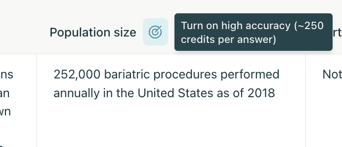
Data extractions are the part that, in the conventional workflow, a researcher would have to read the entire paper to figure out what data is needed and then copy-paste or paraphrase the data items into their Excel results set. An example extraction would be something like “size of the population” in a study: was it N=15, N=500, or N=10,000?
Elicit uses a blend of different language models to read the PDF (potentially also interpreting tables, charts, or other figures) and extracting that data for each paper into the column automatically.
A few design details on the decomposed approach:
- Response time for any given result cell is highly variable. Some results may come back in under one second, others may take minutes. It’s helpful for the user to see the results as they come in, since they might realize their query needs changing based on the first few responses. We want to populate these promptly without a lot of popping around in the interface, distracting the user. Furthermore, a giant grid of spinners is annoying. The solution we settled on is a placeholder that indicates work-in-progress, without creating a bunch of motion onscreen.
Loading indicators are subtle, to avoid the "screen full of spinners" problem.
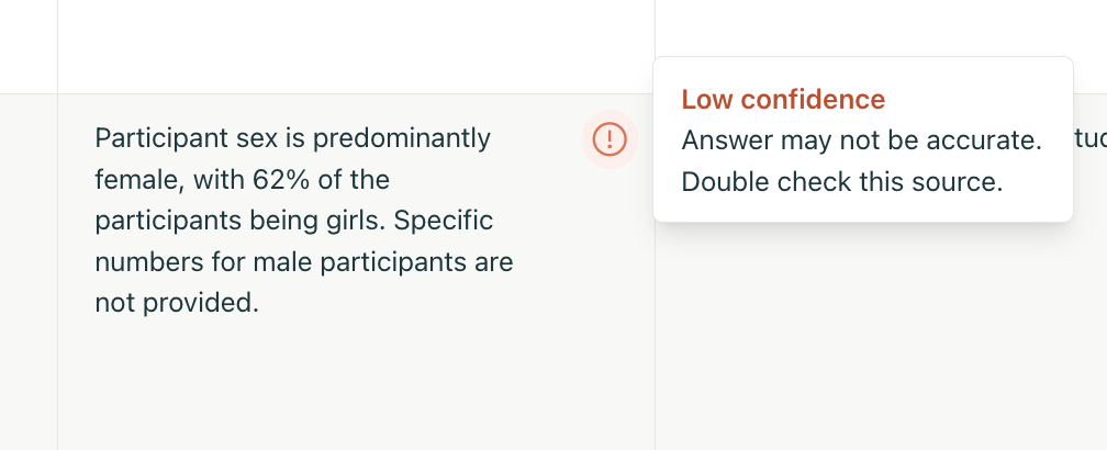
- Flagging low-confidence answers. Accuracy and verifiable results are a huge part of the work we do at Elicit via our ML team—but that’s a whole different article for another day. A small UI detail we can mention here is subtly flagging low-confidence answers. The user can quickly scan the table and decide, for example, whether they want to rephrase the data extraction question in a different way that the AI will be better able to answer with confidence.
- Drill in on source quotes supporting the claim. For a given AI answer embedded in the table, the user can verify the result by clicking on the cell and flipping through relevant quotes (shown in context of the paper) supporting the claim. This is the human-in-the-loop design philosophy: AI and knowledgeable operator together can be more efficient and effective than either alone.
Click an answer to check how it was sourced.
Managing batch workloads, without feeling like you are
The next piece of UX to consider is that this editable results table is secretly a big-batch workload manager in the browser.
One of our design goals is to present an interface that feels light, fluid, and approachable. This despite the fact that, behind the scenes, thousands of GPUs across hundreds of machines may be grinding away on serving the user’s result set.
From the time the user presses enter on their search, users can interact with the first skeleton of the progressively-constructed document right away. This means the page needs to stay responsive and queue up new work in response to edits, even before the existing work is complete.
To see how the workload grows, consider that loading papers (adding rows) and new extractions (adding columns) expands the result set quadratically. For example, fifty papers with twenty data extractions is already 1,000 individual cells to be generated! And each cell may involve a handful of model calls. A user doing an apparently trivial action can kick off thousands of backend actions.
Some UX challenges inherent in this model:
- Timeouts have to be chosen with care. Thirty seconds is universally given as a common timeout on the web, but language model calls can sometimes take longer, especially when stacked up in a queue.
- Onscreen results prioritizing work over offscreen. This is especially true in a large table where very often the upper-left of the table is what the user sees, and the other parts only filled in as they scroll.
- Per-cell errors handled gracefully. Given the non-deterministic nature of LLM calls, errors and retries are just a part of life. Our UI has to find a balance between keeping retries quiet to avoid being noisy and distracting, versus surfacing when the system is generally struggling under load or otherwise producing an unusual amount of errors.
Visualize cost, avoid surprise
The final UX challenge to cover in these living documents: cost.
A big difference with AI as a medium compared to conventional systems is that the marginal cost of user action is extremely high. LLM calls are measured in seconds and can cost cents per request.
That means we need to track these costs and expose some version of them users—an all-you-can-eat model doesn’t work, and probably won’t as long as GPU-hungry new models continue to appear.
Utility-based billing (for example, one search costs $0.01) is a good solution for surfacing costs to customers and mapping usage (and value) to how much they pay. However subscription models (pay one fixed monthly price) are more understandable for customers.
Elicit uses a blend of these two in a credits systems, where customers get a fixed number of credits to use per month and the option to top up with more credits when needed. Then individual actions a user can take are marked with some indicator of credit cost.
Some design details here:
- Expected cost indicated by credit icons next to actions. One, two, or three coins maps to small, medium, and heavy requests respectively.
- Where possible, provide exact estimates. High-accuracy mode is slower and much more expensive, but may be able to catch details that regular mode misses. Here it’s 250 credits per answer, making clearer that the cost will go up as your result set is larger.
- Don’t bill for retries. As mentioned in the workloads section, language models calls can fail frequently and Elicit retries automatically behind the scenes. Our ethos is to bill for value delivered rather than work done, so we absorb the cost of retries and other fault tolerance.
Overall the billing method is very much a work in progress. We’d love to make cost visibility less of a concern for users in the course of their regular work, and perhaps with time (including changes to underlying language model cost, and more data on average usage) we’ll be able to do this. But the reality is that this is a key area of UX for us, and will be so for anyone doing products that rely on serious use of AI in this way.
Open questions
As Elicit’s customers push scale ever upward with larger systematic reviews and more complex workflows, there are a host of UX problems yet to be solved.
A sampling of these:
- Eager loading vs virtualization of large tables. Right now Elicit kicks off as many backend tasks in parallel as possible, and eagerly loads everything into the browser. But for a large query (for example, 3000 uploaded PDFs) the user is typically iterating on the query by scanning the results in the first 10–20 rows. Once they’re satisfied the query is what they want, they download all results as a CSV, never even viewing the majority of the results on the web. More sophisticated virtualization of these large tables and filling in results on demand (scrolling/paging further in the table, or at export) would avoid a lot of unnecessary work and cost.
- Separate batch mode vs realtime. This is equally a UX and technical question. If the user passes some arbitrarily-defined level of scale, should the UI switch to a batch mode with different affordances? Instead of trying to respond instantly to edits, users would queue up a batch of work and then start the process, returning later to see the results. This may also fit with cost concerns, since it moves the user into a mentality of committing to a well-defined, weighty chunk of work. But it stands in contrast to our design goal of hiding the batch workload aspect of the product.
- Navigating large documents. The grid of results (papers in rows, extracted data items in columns) is one of the superpowers of Elicit. But it can also be a stumbling block, as the grid of results grows to be difficult to scroll through and navigate. This is especially notable on small screens e.g. laptops. We’ve pondered a variety of options here including pagination rather than scrolling, minimaps, infinite-canvas style pan and zoom, header row/column pinning, and more.
- Better cost visibility for customers. Users are still often surprised by which operations are the most costly. Some of this is the inherent nature of unpredictable model call costs, but some of this we think we can improve with better visibility and a clearer mental model for customers to think about which queries are most costly.
- “Skating to where the puck is” on new language models and cost vs quality. Following on from the above, the release of new models (such as Lama 3 and GPT-4o, both recently released at the time of this article) change user expectations. New models may be able to do the same thing at a lower cost; or more commonly, get better-quality results but at a higher cost. How to incorporate this into our product is a question we need to revisit often in the fast-moving space of AI.
- Multi-user collaboration. As more organizations are using Elicit, they want everyone on the team to be able to edit the results documents. At the moment this is possible by sharing a single login, but extending to true multiplayer is feasible with our streaming-messages infrastructure and would be a significant improvement.
Conclusion
It’s easy to think that AI advancements are all about training and applying new models, and certainly this is a huge part of our work in the ML team at Elicit. But those of us working in the UX part of the team believe that we have a big contribution to make in how AI is applied to end-user problems.
We think of LLMs as a new medium to work with, one that we’ve barely begun to grasp the contours of. New computing mediums like GUIs in the 1980s, web/cloud in the 90s and 2000s, and multitouch smartphones in the 2000s/2010s opened a whole new era of engineering and design practices. So too will LLMs open new frontiers for our work in the coming decade.
We hope that the Elicit approach to living documents serves as one example of a new form of AI UX.
Want to work on problems like these?
Join our team as a product designer, front-end engineer, or another of our open positions.
Careers at Elicit